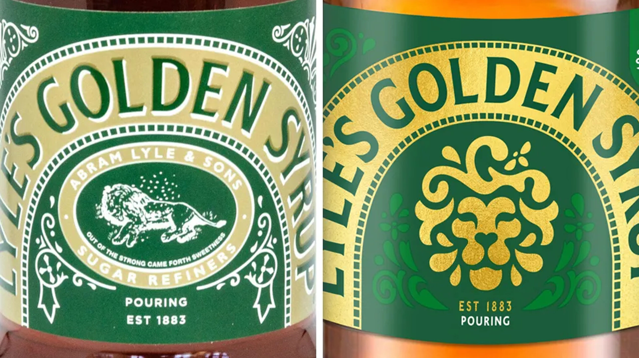
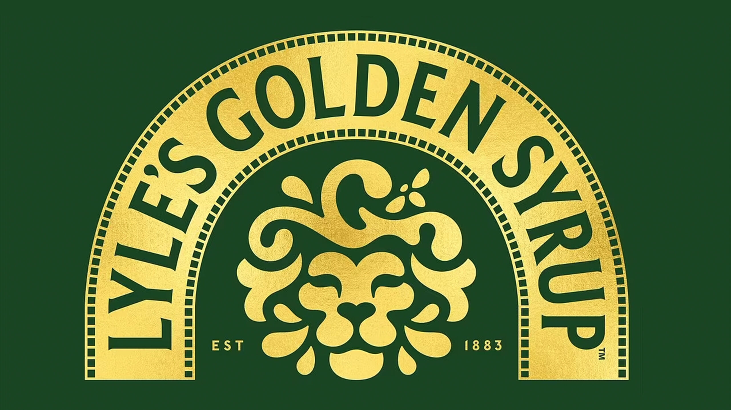
Out With The Old And In With The New
With company rebrands we’ve seen Pringles Mr. P get a hair cut, Twitter switching out the bird with an ‘X’ and now Tate & Lyle’s Golden Syrup drops the iconic dead lion.
In a bid to connect with a younger audience, Lyle’s Golden Syrup has revamped its logo after nearly 150 years. Departing from tradition, the new design mirrors a prevalent trend in branding and packaging by creating a simple and flat logo.
The company’s recent decision marks a significant shift in its visual identity. What are your thoughts on the rebrand? Do you think it should have stayed the same?